
Brand identity
Nomi Black
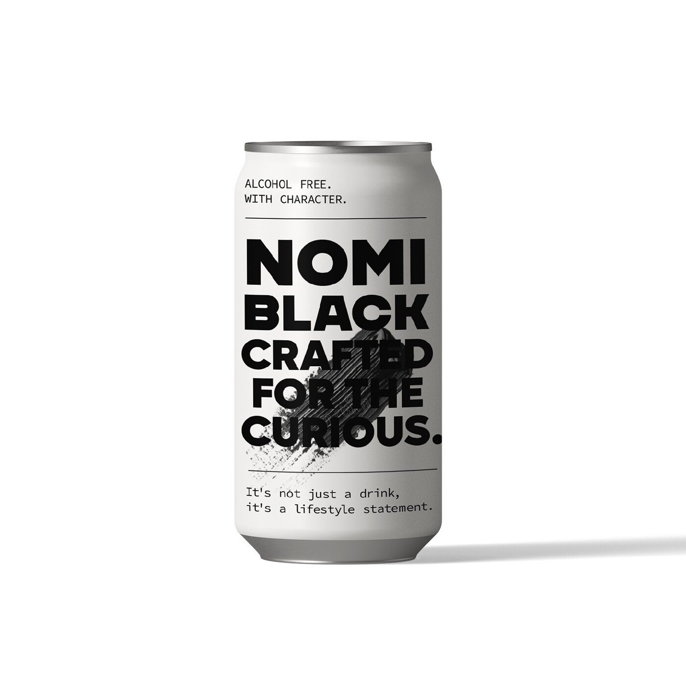
The design of Nomi Black stems from the integration of the rebel and the sage archetypes, proposing a bold, sophisticated and conscious alternative within the alcohol-free cocktail segment.
The visual concept centres on a striking, modern typeface accompanied by a black brushstroke — a symbol of creativity, authenticity and an elegant break from convention. That composition reflects the restless spirit of the premium consumer, who looks for original and expressive experiences and moves away from traditional market expectations.
The archetypal pairing solves the category’s central problem. Alcohol-free drinks have long been designed as substitutes, borrowing the codes of spirits and inevitably reading as the lesser option. The rebel refuses that framing; the sage justifies it. Together they let the product be a choice rather than a compromise.
The black brushstroke carries the argument in one gesture: made by hand, impossible to repeat exactly, and confident enough to stand alone. It gives the brand a statement rather than a substitute’s apology.