
Packaging & labels
Neura
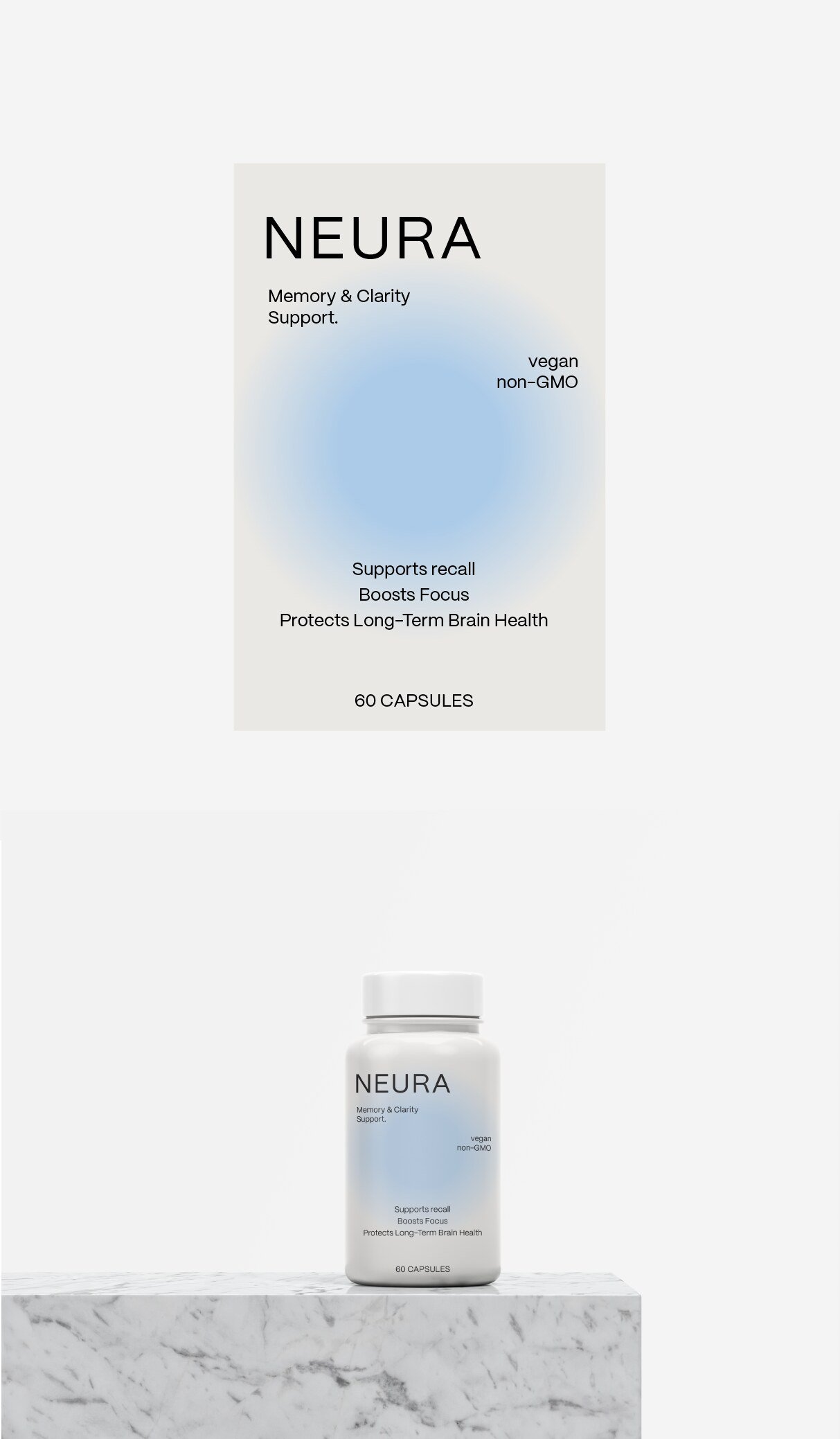
Premium supplement bottle design for a modern brain health brand.
The design is inspired by the world of premium cosmetics, moving away from the traditional look of supplements. The visual identity is built on purity and clarity, with a minimalist label that conveys confidence and modernity.
A soft blue gradient gives the product a sophisticated, recognisable air, evoking calm, wellbeing and mental vitality. The sans-serif typeface reinforces solidity and scientific credibility while providing balance and visual lightness. Wide, airy spaces avoid information overload and accentuate the product’s premium, lifestyle character.
This approach makes Neura a supplement that feels like a designed object — intended to be visible on the kitchen counter or bathroom shelf rather than hidden in a cupboard. That is a commercial decision as much as an aesthetic one: a supplement kept in sight is a supplement that gets taken, and a bottle worth displaying does marketing work every day it sits there.
The result communicates health, science and sophistication in a single package.