
Brand identity
Oil Retreat
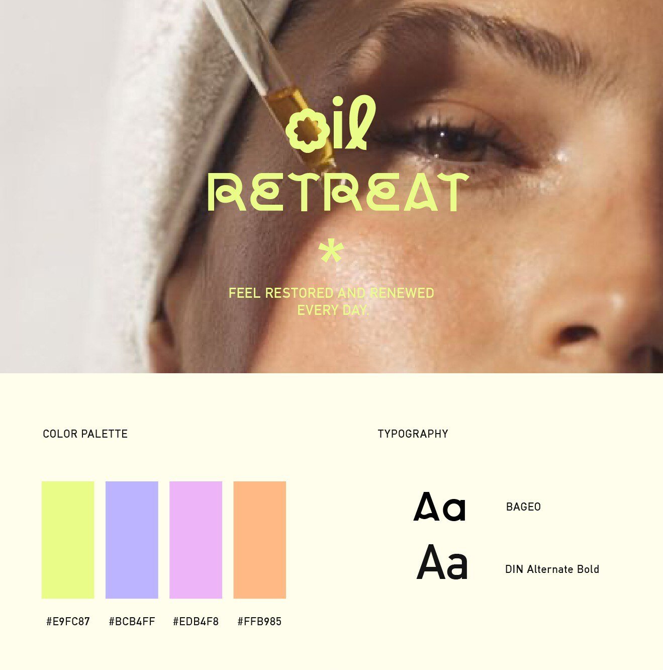
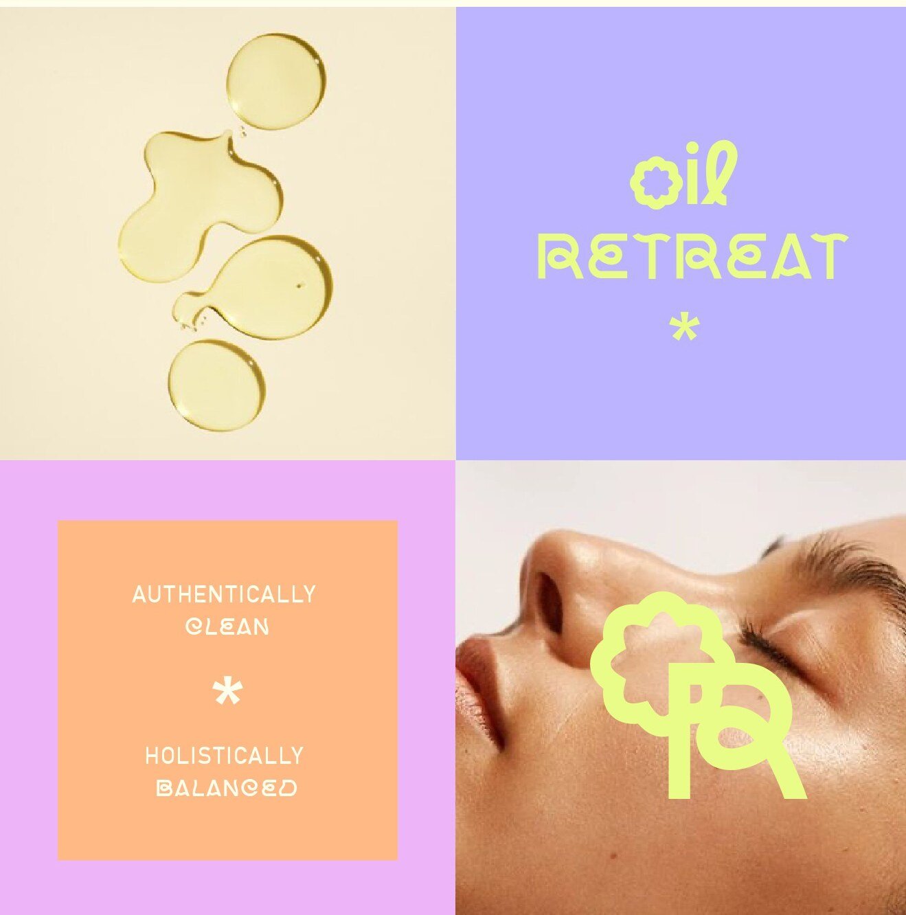
For Oil Retreat, an organic oil skincare brand, I developed a colourful, fun and youthful visual identity that stands out in the beauty industry.
The logo and packaging combine modern minimalism with vibrant yellow tones, reflecting the brand’s fresh and approachable personality. That combination is the point: organic skincare tends to signal its credentials through muted earth tones, so a saturated palette reads as a deliberate departure rather than a default.
Inspired by current trends, the design features clean lines, custom typography and playful yet sophisticated elements aimed at a contemporary, health-conscious audience. The slogan creatively integrates the “O” and the “R” for a distinctive, memorable touch, and the palette explores bright colours for a feel that is natural and luxurious at once.
The result gives the brand something rare in organic beauty — a shelf presence that is immediately recognisable without abandoning the natural positioning the products depend on.