
Packaging & labels
AlpenPower
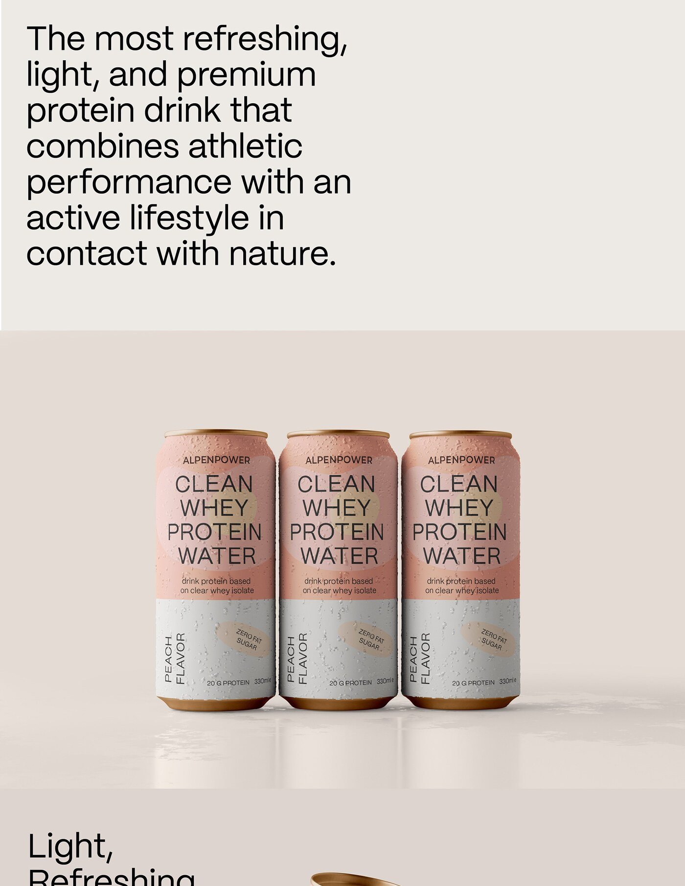
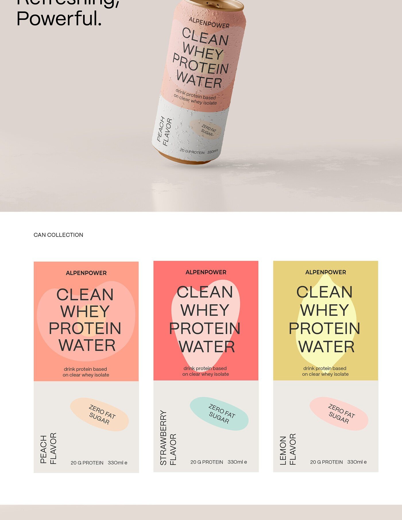
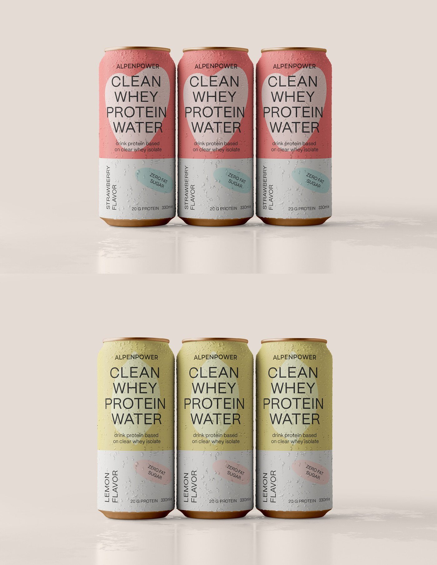
This design seeks to capture the essence of AlpenPower: purity, naturalness, and performance, with a contemporary and premium visual language. The packaging conveys a sense of freshness and modernity, inspired by the Alpine purity and the lightness of the beverage. I opted for a minimalist and clean design, in which each element has a clear purpose: to communicate quality without being overwhelming. The design projects a premium, modern, and functional product, designed for athletes, fitness enthusiasts, and active people looking for a light and refreshing protein drink. The visual identity is adaptable to future flavor variants, maintaining consistency and elegance across the range.