
Packaging & labels
Healthy Spoon
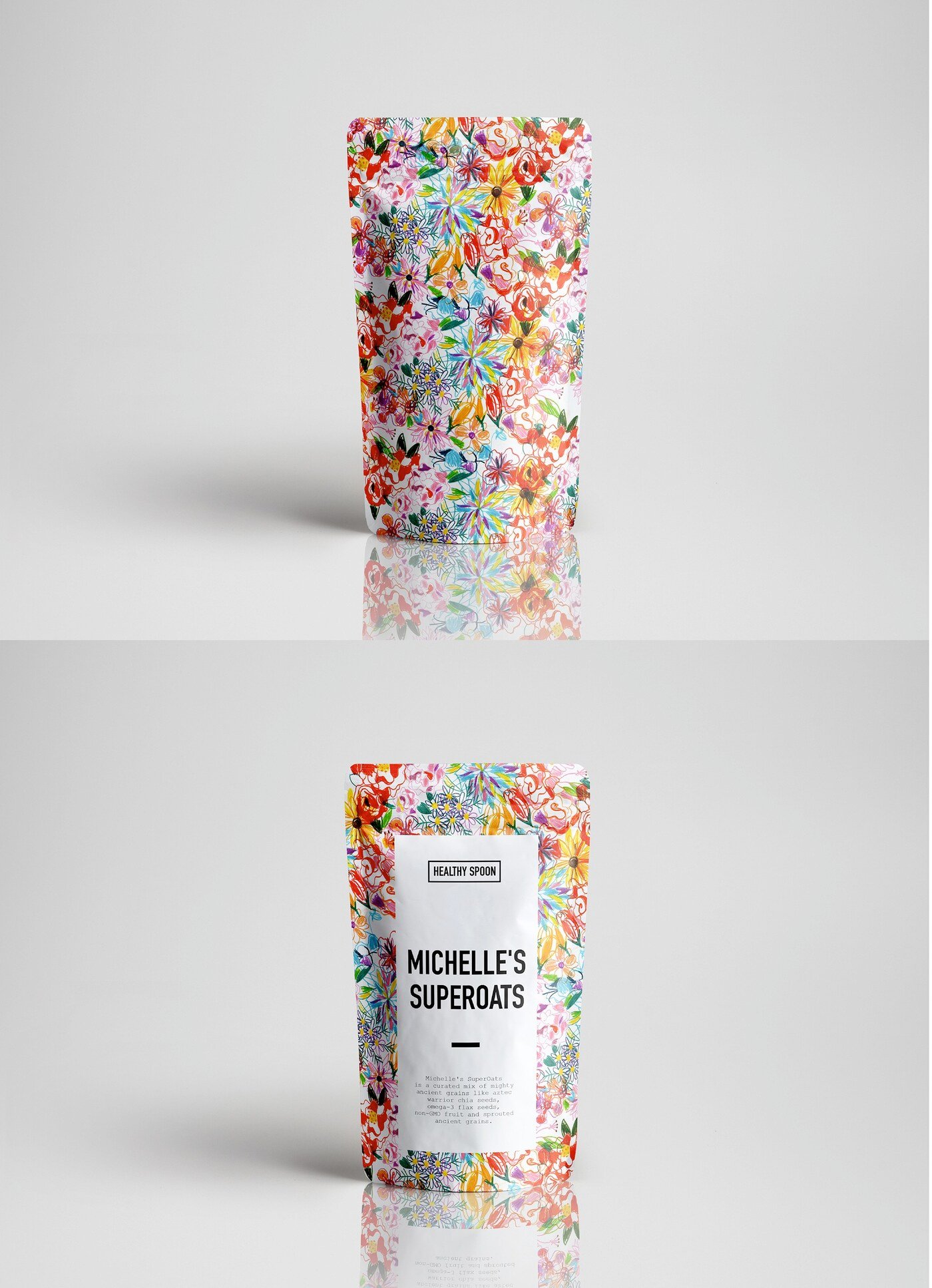
Healthy Spoon needed packaging for Michelle’s Australian SuperOats, a product within their food range.
Oats are a commodity. What separates one box from the next on the shelf is almost never the contents — it is whether the packaging feels like something made by a person or assembled from stock assets. That framed the whole approach here.
A floral pattern was drawn entirely by hand for this packaging, giving the product a texture and irregularity that no typeface or template could supply. The imperfection is the point: visible brushwork signals a small-batch, considered product in a category dominated by industrial photography and health claims set in bold sans-serif.
The pattern also solves a practical problem. As a repeating surface it can be cropped, scaled and recoloured across formats and future flavours, so the brand gains a recognisable graphic asset rather than a one-off illustration tied to a single pack.