
Brand identity
WTF – Where’s The Food
WTF — Where’s The Food — is a mobile application for discovering nearby luxury restaurants. The target audience is young professionals and second-generation wealth, aged 25 to 40.
The name is the interesting problem. It is a joke, and it is deliberately at odds with the luxury positioning, so the identity had to hold both registers without collapsing into either. Play it entirely straight and the wit disappears; lean into the gag and the app stops feeling like somewhere you would book a table worth booking.
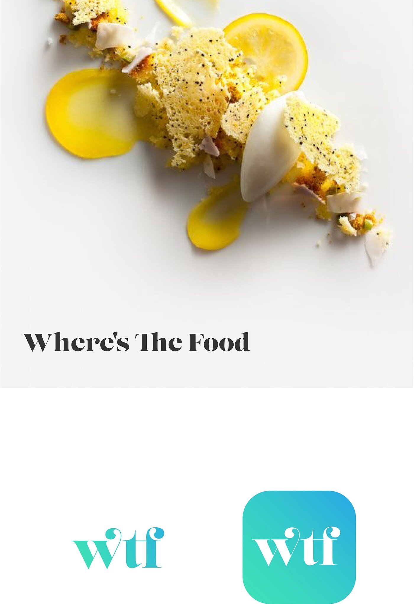
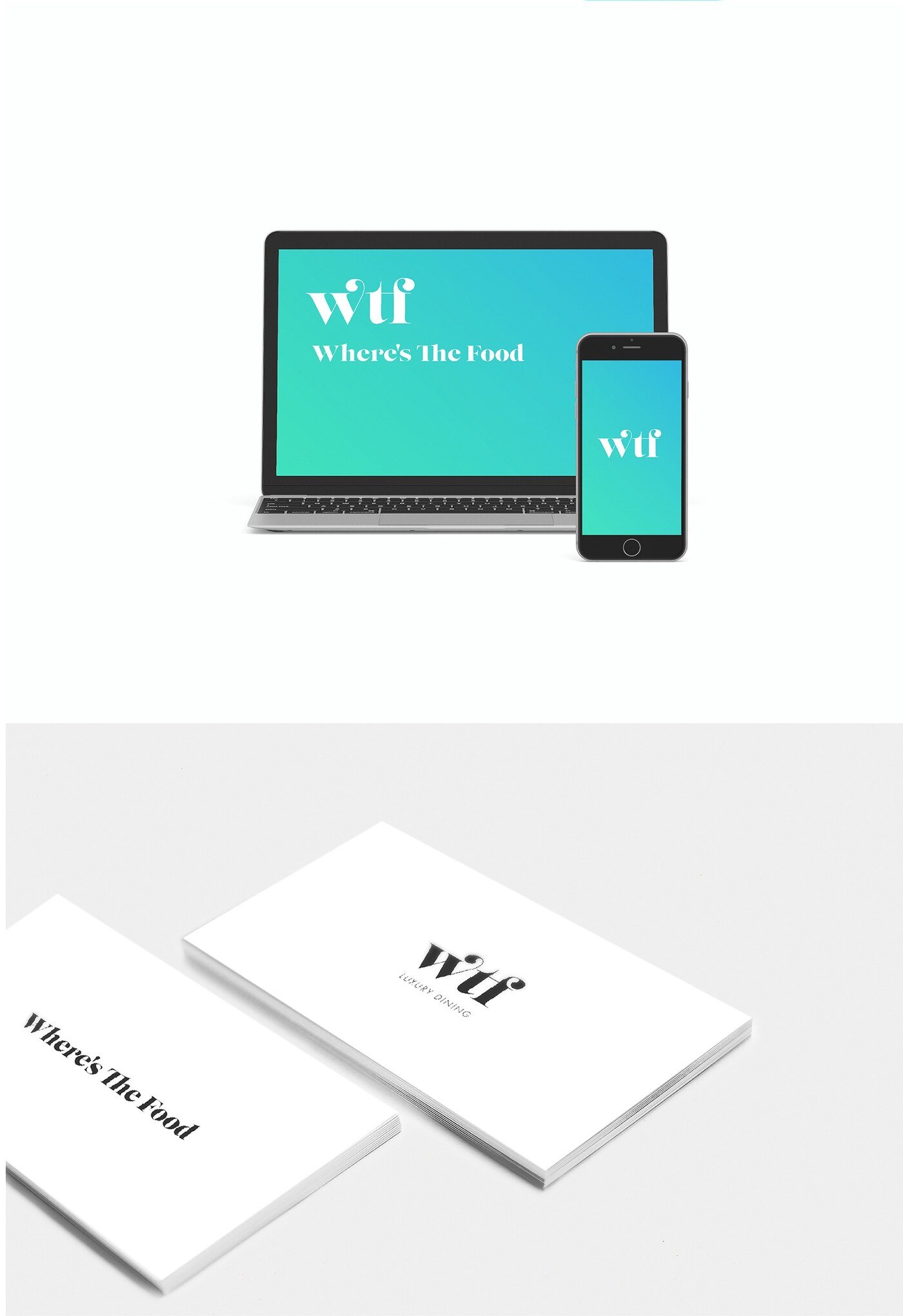
The resolution came through serif typography, which carries the luxury argument with the authority the audience expects. That formality is then modernised in the application icon through a gradient treatment, pulling the mark into the visual language of a phone screen. The tension between a classical wordmark and a contemporary app icon is what makes the name work rather than undermine the brand.