
Brand identity
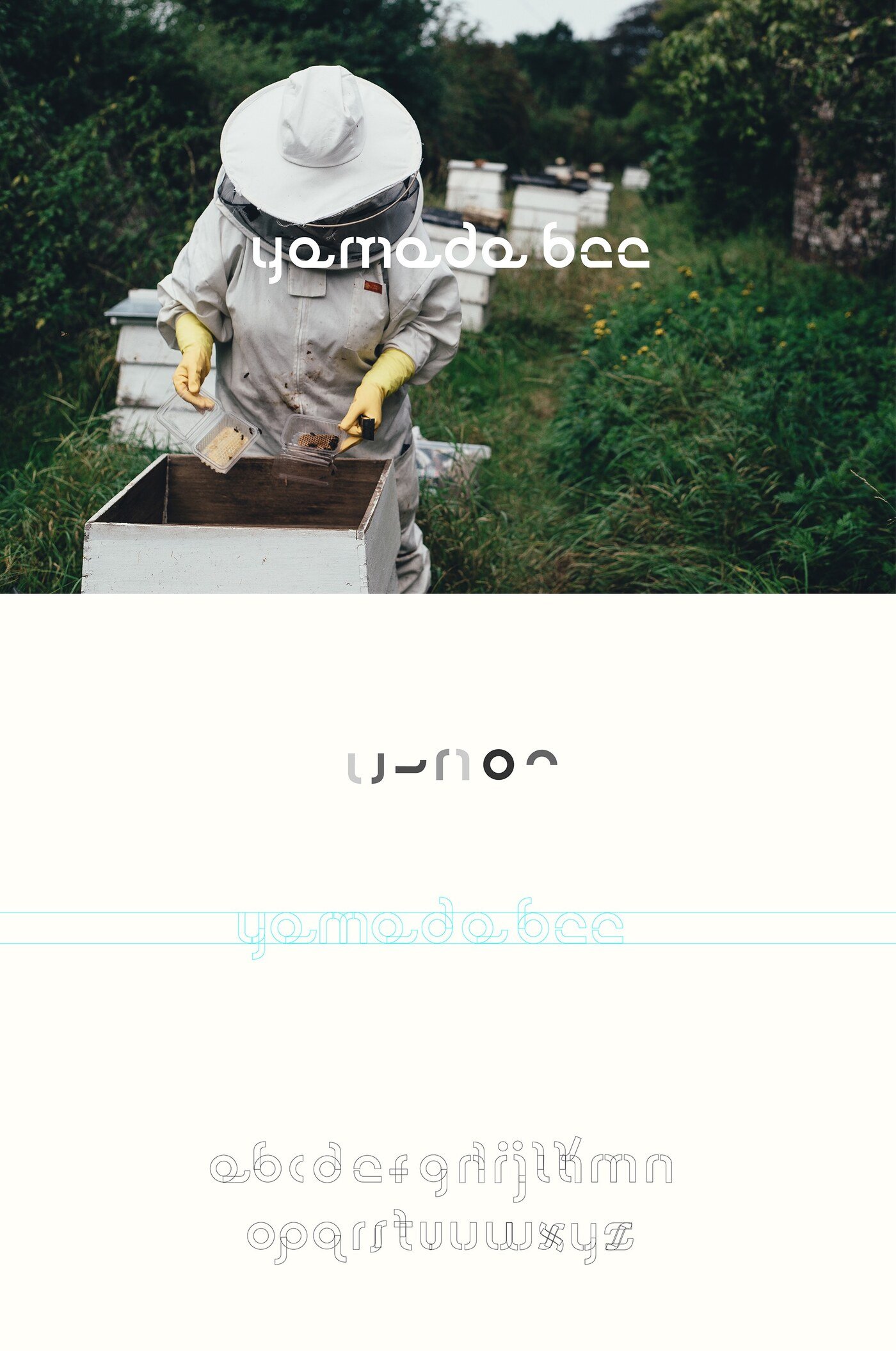
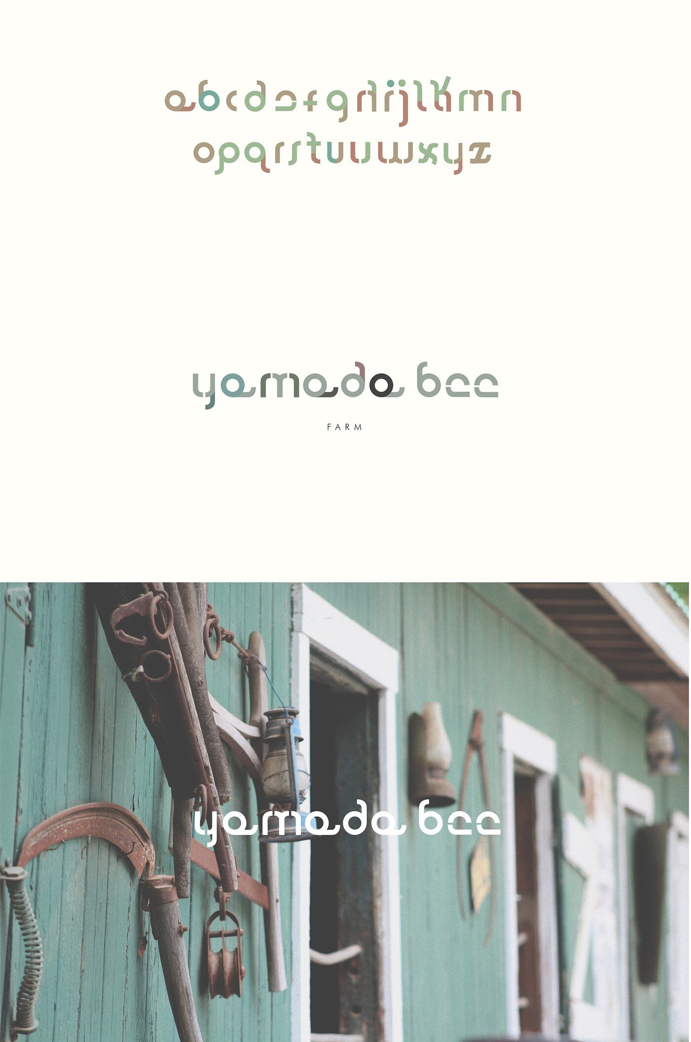
Yamada Bee
Yamada Bee produces and sells honey-based products spanning health foods and cosmetics.
A brand working across two very different shelves needs a system flexible enough to travel without losing its identity. The answer here was a modular typeface built specifically for the project: a set of repeatable geometric units that assemble into letterforms, echoing the hexagonal logic of honeycomb without ever resorting to a literal bee or hive illustration.
That structural approach gives the brand a distinct visual signature and a practical advantage — the same construction rules generate headlines, product names and graphic patterns, so the identity scales across a growing catalogue without needing to be redrawn each time. The result is a mark that feels crafted and contemporary at once, and that sits comfortably next to both a jar of honey and a skincare product.