Brand identity
Iron Software
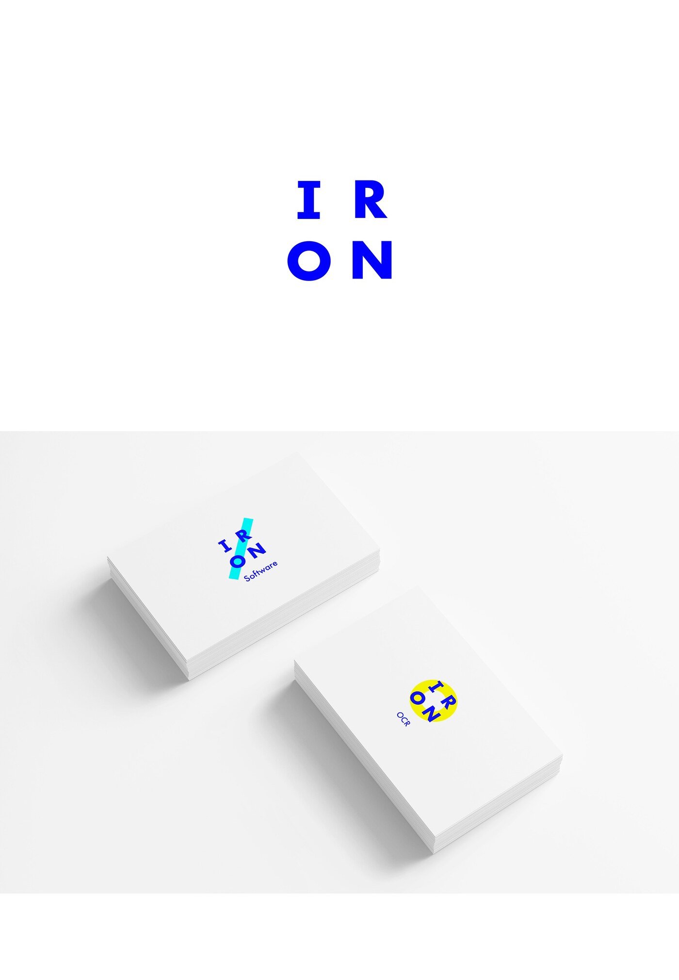
Iron is a software company that builds clever tools used by corporate software engineers. The brief called for a strong, modern design.
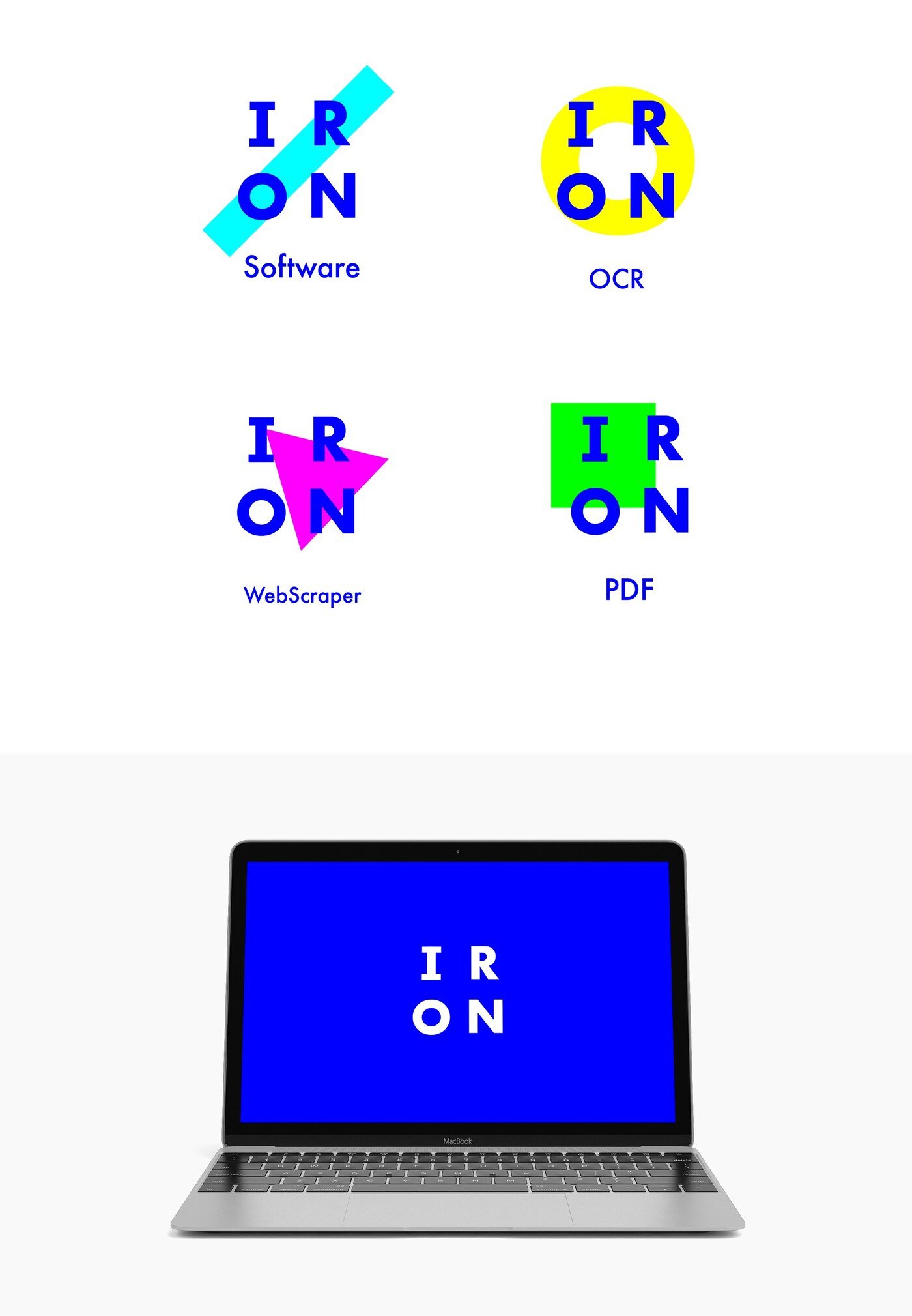
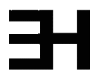
The audience here is unusually literal-minded: engineers notice structure, and they notice when something has been decorated rather than designed. So the logo was built rather than drawn. Playing with the four letters of the name, the mark is constructed from a small set of shapes that lock together — a system with visible rules, which is exactly what the audience responds to.
Four RGB colours run through that structure, giving each product in the range its own identifier while keeping the parent brand intact. This solves the practical problem of a growing tool suite: new products slot into the existing logic instead of forcing a redesign.
A second route explored the same construction principle while incorporating elements drawn from software code itself, pushing the reference from abstract structure toward the material the company actually works in. Both directions are shown here.