
Brand identity
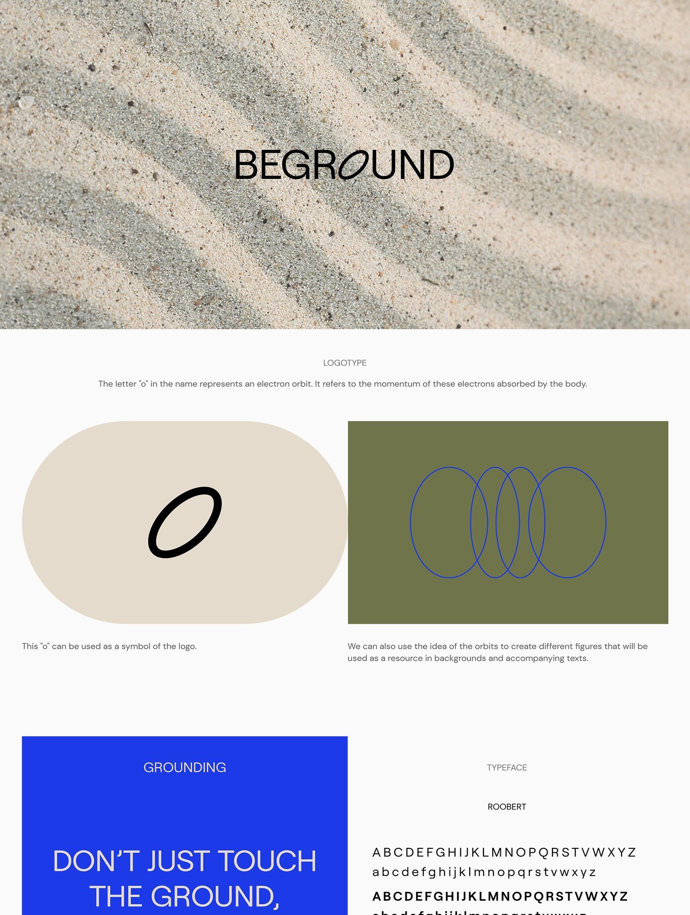
Beground
Beground sells earthing products, B2B and B2C, that electrically ground people while they work (Work Pad) and while they sleep (Sleep Pad). This electrical grounding carries a range of physical health benefits.
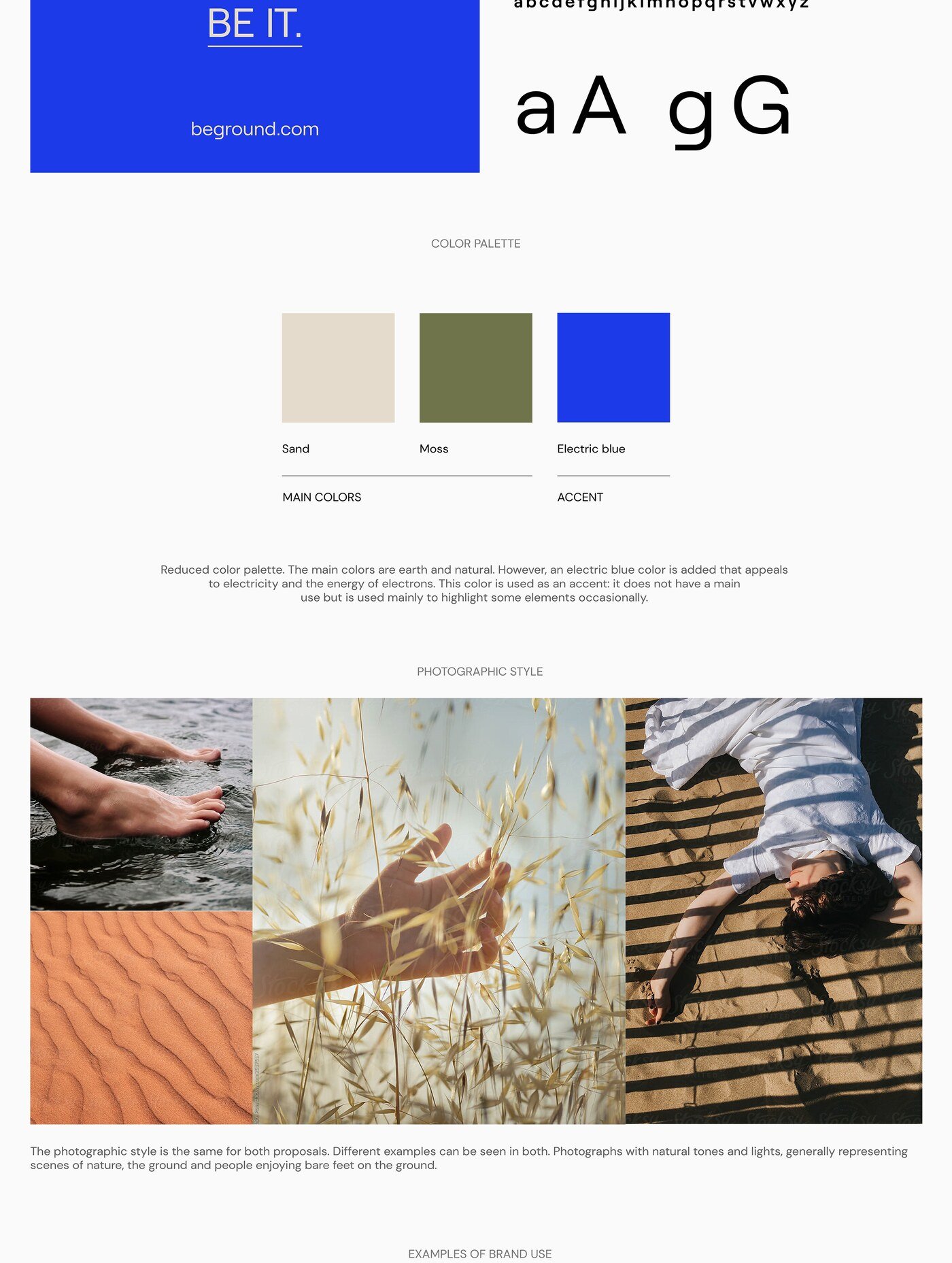
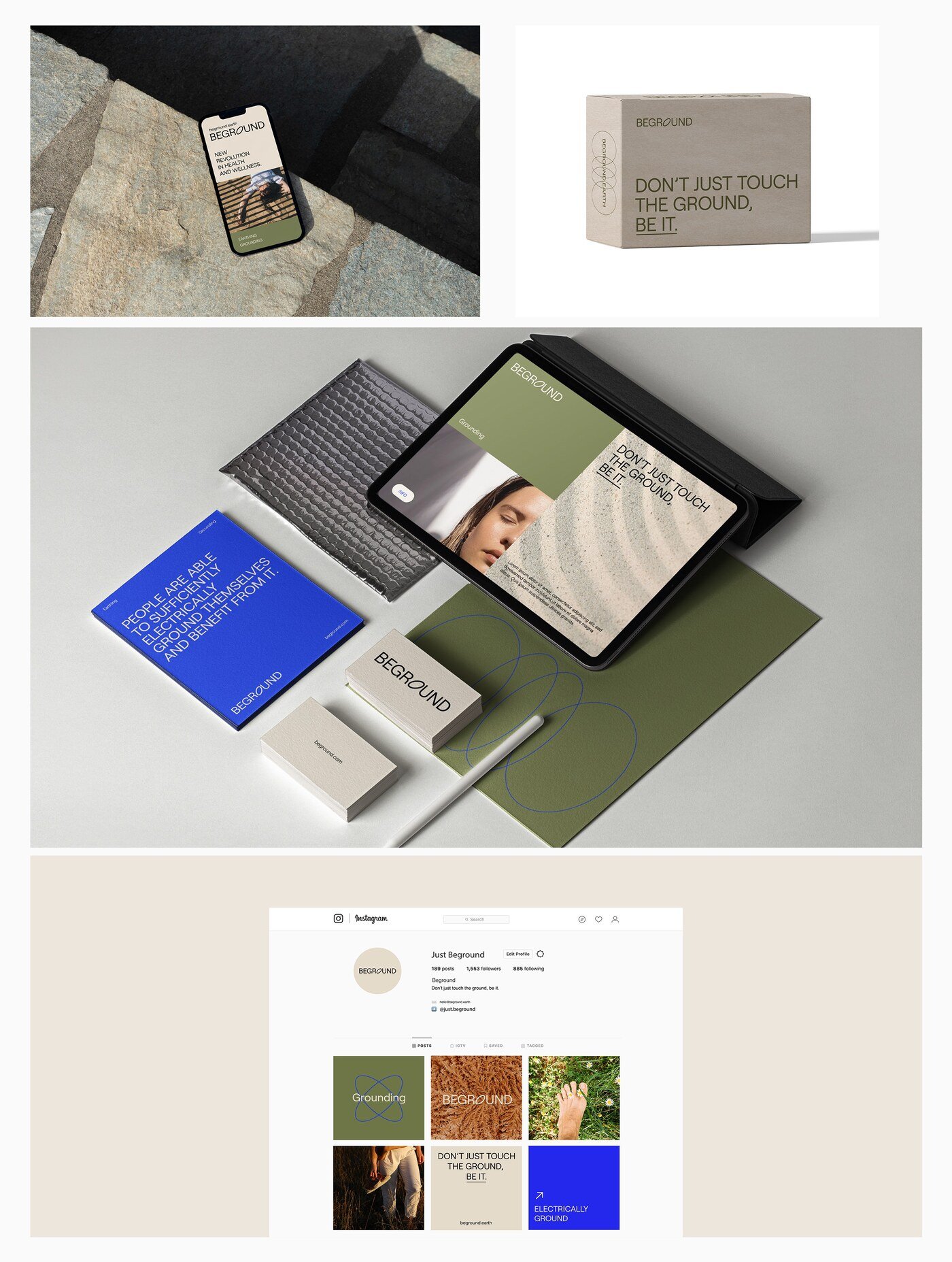
For this project I developed the brand name, the visual identity, the brandbook, the packaging design and the web design — a full build rather than a redesign, which meant every decision could follow from the same argument instead of accommodating an existing one.
The name is where the strategy sits. “Beground” holds “be” and “ground” together and turns a technical concept into something a customer can repeat, which matters enormously in a category most people have never heard of. Before it can sell, this product has to be explained.
Everything downstream serves that explanation. The identity and packaging make an unfamiliar object feel legitimate rather than fringe, and the website carries the reasoning — a real requirement when the brand sells to both distributors and individuals, two audiences that need the same claim proved in different ways.