Brand identity
Outlaw Grooming
Brand identity for a men’s skincare line.
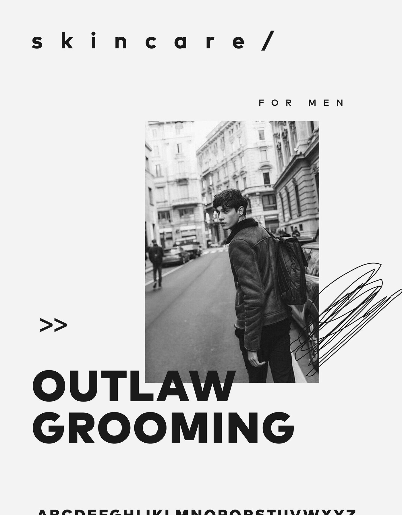
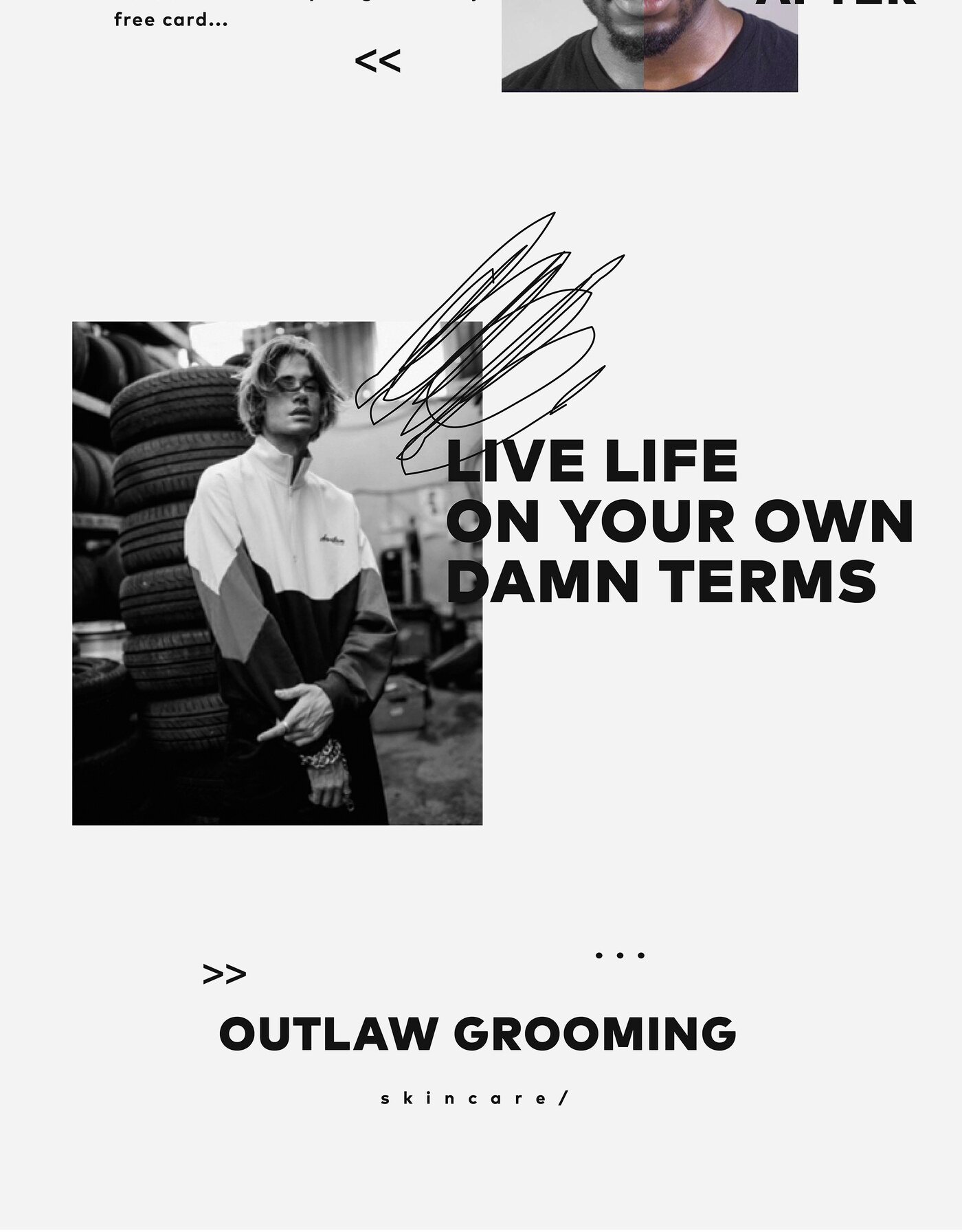
The name sets a clear direction and a clear trap. “Outlaw” invites the visual shorthand men’s grooming has leaned on for years — black packaging, heavy slabs of type, borrowed workshop and biker imagery — a language so widely used that it now signals conformity rather than rebellion.
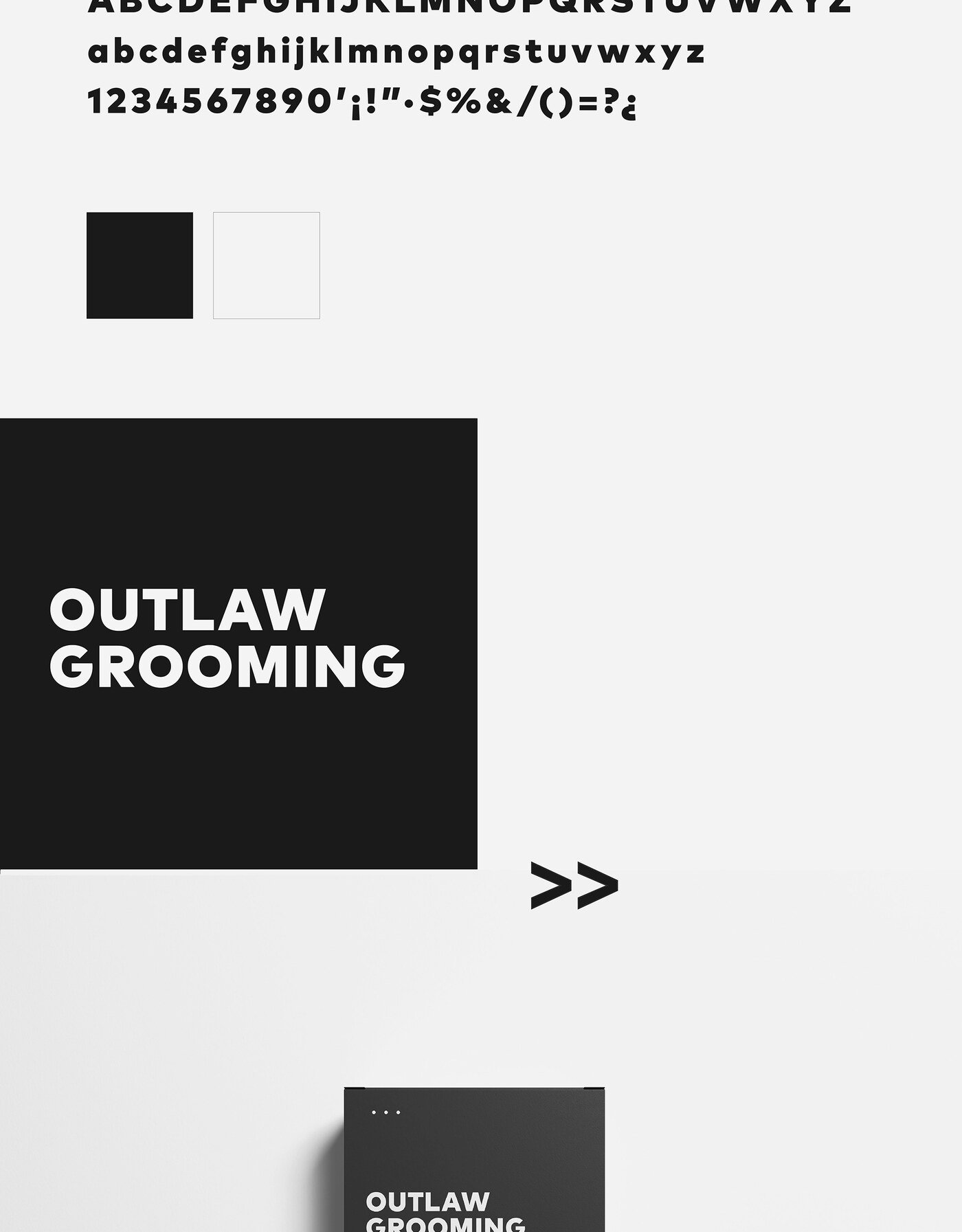
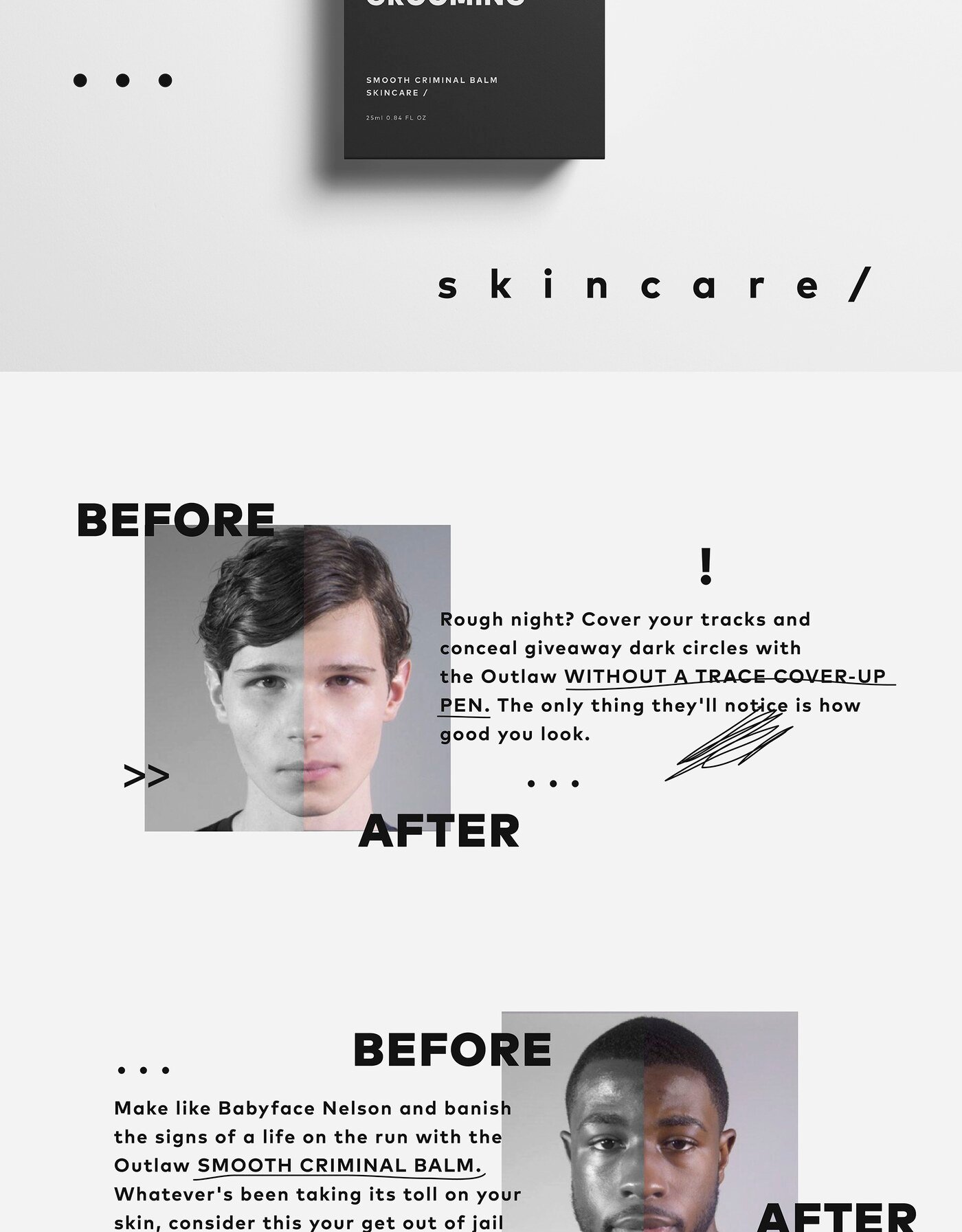
The identity takes the name at its word instead. Being an outlaw in this category means not looking like the rest of the shelf: cleaner construction, more confidence in the typography, less armour. The result still reads as unmistakably masculine, but earns it through restraint rather than volume.
That choice also serves the product. Skincare asks a customer to trust what is inside the bottle, and a design that shouts tends to undercut the claim it is making.