

Wordmark, symbol, combination mark or emblem: which one your brand needs
Wordmark, symbol, combination mark or emblem: which one your brand needs
They get used as synonyms and they are not. The distinction matters because each type behaves differently on a twenty-millimetre pack, in a circular Instagram avatar or embroidered on a textile label.
The four types
Wordmark
Text only. The name drawn with a worked or redrawn typeface. It is the most direct type: it says who you are with no intermediary. Its limit is space, because a long name does not work in square or very small formats.
Symbol or brandmark
Symbol only, no text. It works when the brand is already known and the symbol has enough mileage to identify it on its own. For a new brand, starting with a pure symbol is an expensive bet: it needs a lot of repetition before anyone associates it with you.
Combination mark
Symbol and text that can be separated, side by side or stacked. You can use the symbol alone on a jar cap and the full lockup on the carton. It is by far the most practical type for product brands.
Emblem
Symbol and text fused into a single indivisible piece. Seals, crests and badges usually are. It is the most attractive type in a presentation and the most awkward in use.
How to choose
The useful question is not which is prettier, but where this is going to appear. Make the list of real applications before deciding:
- Pack front and cap or closure.
- Neck label, seal or tamper band.
- Square and circular avatars on social.
- A 32-pixel favicon.
- Email signature and stationery.
- Marking on material: embroidery, engraving, blind emboss.
- Shipping box and tape.
If your list includes both tiny and generous formats, you need a combination mark: it gives you an autonomous symbol for the small stuff and a full lockup for the large. If your brand is a consultancy living in stationery, web and decks, a well-resolved wordmark is enough and faster to build.
Brand identity
We build complete brand systems: every version, the guidelines and the files organised by use. Not a logo on its own.
The catch with emblems
Because symbol and text cannot be separated, in very small or very wide formats you have no way out: either you shrink until the text fills in on press, or you improvise an alternative version that breaks the coherence.
If you choose an emblem, design a legitimate reduced version from the start, documented in the guidelines with its minimum size. It is not a patch: it is part of the system.
The three-format test
Before approving a mark, print three proofs: one at 15 millimetres wide, one at 60 and one at 200. Then look at them from a metre away. If the small one turns into a smudge or the large one looks empty, the system needs more versions, not a different drawing.
Positive, negative and one ink
Every mark should work in black on white, white on black and in a single flat ink. It is a ruthless and very useful filter: the gradients, shadows and two greys that felt essential tend to fall away there, and what is left is stronger.
This matters especially in packaging, where marking may be blind emboss, foil or one-colour screen printing.
What actually makes the difference
Not the type of mark: the system around it. A solid brand delivers horizontal, vertical and reduced versions, in positive and negative, with clear space and minimum sizes defined, plus files prepared by use.
Without that, any of the four types degrades within six months: someone stretches the logo to fit, someone else puts it on a photo with no contrast, and a third crops the symbol out of a PDF.
Frequently asked questions
Can I have a combination mark and an emblem?
You can have a primary version and a seal version for specific uses, as long as the guidelines define when each one is used. What does not work is alternating them without criteria.
Does the symbol have to mean something?
Not necessarily. Many powerful symbols describe nothing: they work through repetition and recognisable form. Chasing literal meaning tends to produce cluttered symbols.
Which type is best for trademark registration?
A word mark registration protects the name regardless of its form; a figurative registration protects one specific graphic version. Many brands register both, but that is worth discussing with an industrial property agent.
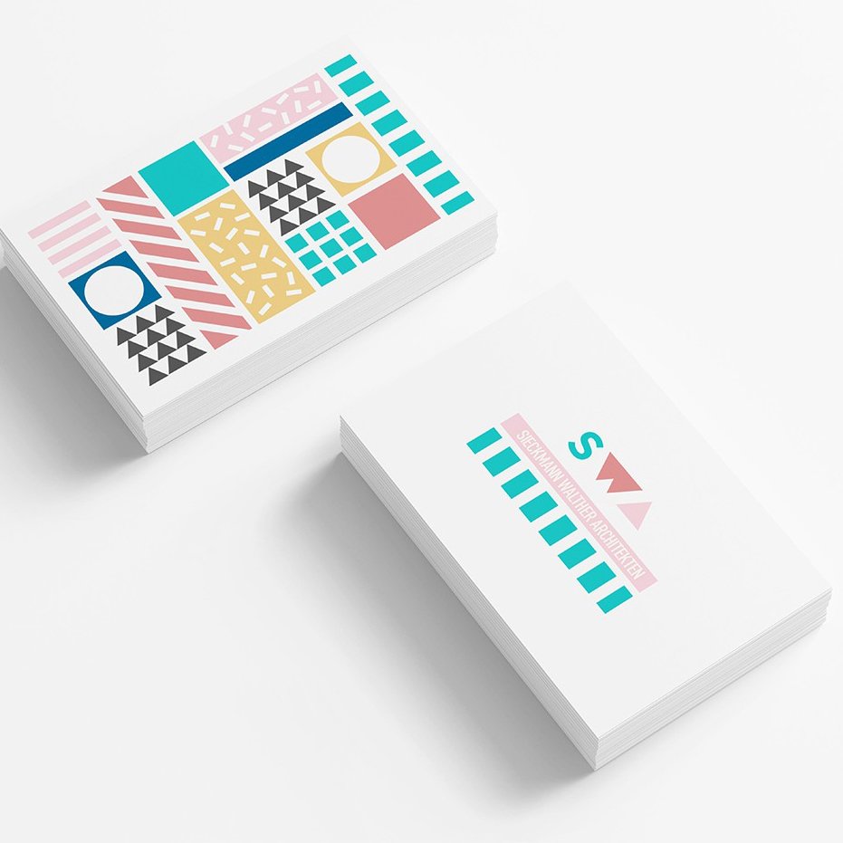
In our brand identity projects we always deliver the complete system, not a single file. You can see it applied in success stories.